The Outlaw brand kit
Everything you need to represent Outlaw correctly — the mark, the wordmark, the palette, and the type. If you're writing about us or integrating the API, this page is the source of truth.
Mark & wordmark
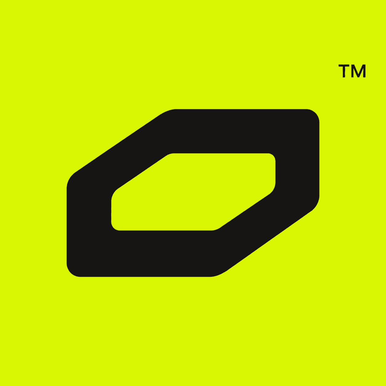
Primary mark — neon tile
Wordmark — Geist semibold, neon “law”
Color
A near-black canvas, warm ink, and exactly one electric accent. Semantic colors carry meaning on the terminal — never use them decoratively.
Robin Neon
The accent. One per surface.
Canvas
Near-black base for everything.
Ink
Warm near-white text.
Electric Teal
Decorative second stop only.
Verified
Safe / complete states.
Pending
In-progress states.
Danger
Risk. Nothing else.
Typography
Aa Fraunces
Display serif
Big headings only. The warm counterpoint to a cold terminal.
Aa Geist
Sans — UI & body
Everything interactive: navigation, body copy, buttons, forms.
Aa Geist Mono
Mono — numbers & labels
Prices, addresses, micro-labels — anything that ticks or truncates.
Usage
Do
- Write it Outlaw — one word, capital O
- Use the neon tile mark on dark surfaces at 24px or larger
- Keep one accent per composition; let black do the work
- Pair the mark with Fraunces or Geist, nothing else
Don't
- Don't recolor the mark or set it on busy imagery
- Don't stretch, rotate, outline, or add effects
- Don't write OutLaw, OUTLAW, or Out Law
- Don't imply a token, endorsement, or partnership without one
Press or partnership use beyond this kit? Write to press@outlaw.markets.